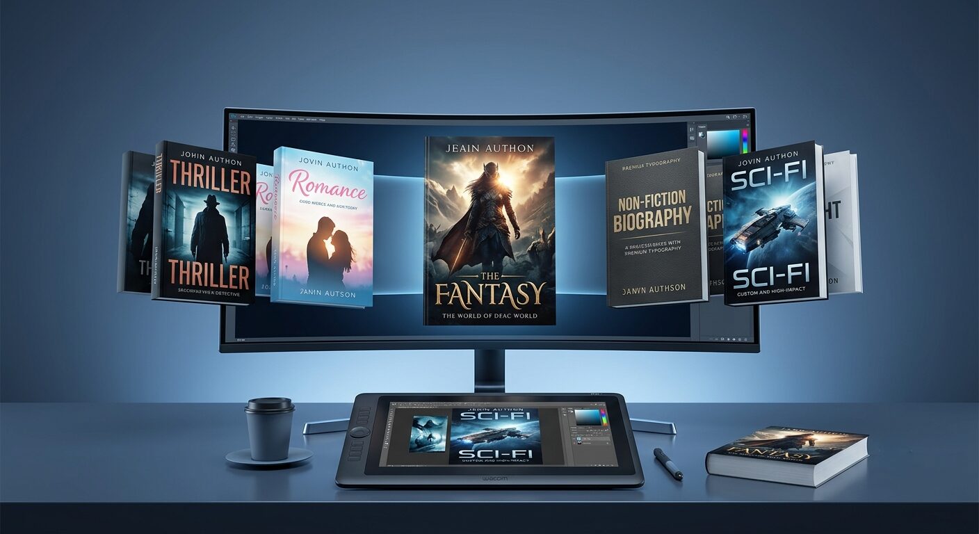
5 Cover Design Trends Dominating Thriller Novels in 2026
Walk through the thriller section on Amazon right now, even just as a scroll of thumbnails, and a pattern starts to emerge fast. The moody, photo-collage covers that dominated the genre five years ago are quietly losing ground to something starker, bolder, and far more deliberate about what it’s trying to do in the half-second a reader’s thumb hovers over it. Thriller covers in 2026 aren’t chasing prettiness. They’re chasing a reaction — tension, unease, intrigue — and they’re getting there with fewer visual elements than ever before.
If you’re prepping a thriller for self-publication this year, here’s what’s actually working, and why each of these trends solves a specific problem that older cover styles were starting to struggle with.
1. Bold, Confident Minimalism
Minimalism isn’t new to thriller covers, but it’s evolved into something more assertive. The old version of “minimalist” often meant a quiet, restrained cover — a single muted object on a plain background. The 2026 version is louder: one striking visual element, strong typography, and high contrast doing all the work, with absolutely nothing competing for the reader’s attention.
A stark silhouette against a single dominant color. A cracked mirror rendered in two tones. A red key on a black field. The genius of this approach is that it solves the thumbnail problem decisively — when your cover has to compete at 300 pixels wide on a phone screen, a cover with five visual elements turns into mud, while a cover with one strong element reads instantly, even tiny.
This trend works because Amazon shopping happens mostly on mobile now, and a cover that only looks good full-size on a bookstore shelf is increasingly a liability rather than an asset.
2. Typography That Becomes the Image, Not Just Text on Top of One
This is probably the single biggest shift in thriller design this year. Lettering is no longer a layer slapped over a finished image — it’s becoming part of the visual story itself. Designers are stretching titles, fragmenting them, letting them bleed into backgrounds, or building the entire composition around the way the letterforms interact with shadow and texture.
For thrillers specifically, this technique is doing real narrative work. A title that looks slightly fractured, or where letters seem to dissolve toward the edges, signals psychological instability before a reader has read a single word of the blurb. It’s a shortcut to mood that a generic stock photo simply can’t deliver as efficiently.
- Distorted or partially obscured letterforms to suggest unreliable narration or fractured memory
- Type with depth and shadow that makes the title feel like it’s looming rather than sitting flat on the page
- Title-as-centerpiece layouts where there’s barely any imagery at all, just expertly handled type carrying the entire emotional weight of the cover
3. AI-Assisted Concepting, Human-Finished Execution
This one’s less a visual style and more a shift in how covers get made, but it’s reshaping what’s possible at every price point. AI image generation has changed the economics of cover design substantially — authors can now explore dozens of visual directions in an afternoon before a designer ever touches a final file, which used to take weeks of back-and-forth sketching.
The covers actually winning in the marketplace right now aren’t pure AI output, though. The technology is excellent at generating raw concepts, color studies, and mood exploration, but it’s still weak at the things that make a cover sell: knowing what to leave out, respecting genre-specific visual conventions, and getting type placement, spine width, and print-resolution detail genuinely production-ready. The strongest thriller covers in 2026 tend to use AI for rapid concept exploration, then hand the chosen direction to a human designer for the actual typography, composition refinement, and print-ready execution.
This matters practically for your budget and timeline too. Skipping the human finishing step is usually where authors end up with a cover that looks “almost right” but reads as slightly off to anyone who’s spent time around professionally published books — soft anatomy, inconsistent lighting, or generic compositions that don’t quite land as polished.
4. High-Contrast Noir Palettes
Color has always done genre-signaling work, but thriller and psychological suspense covers are leaning harder into deep, moody, high-contrast palettes this year — deep blacks paired against a single sharp accent color, often red, acid green, or a cold electric blue. The effect reads as serious, intense, and a little dangerous, which is exactly the emotional promise a thriller needs to make in under two seconds.
This palette choice does double duty for dark romance-adjacent psychological thrillers too, where the moody aesthetic needs to telegraph both danger and a certain seductive intensity. The trick is restraint: one accent color against deep shadow, not three competing bright tones fighting for dominance.
5. Texture That Rewards a Second Look
The fifth trend is more about feel than composition. Thriller covers in 2026 are layering in tactile, almost handcrafted textures — paper grain, subtle brushstroke marks, embossing-style effects, or fine linework that’s invisible at thumbnail size but adds real depth once a reader clicks through or holds the physical book.
This is partly a quiet pushback against fully AI-generated, overly polished imagery. Readers are picking up on covers that feel deliberately imperfect or hand-touched, and in a marketplace flooded with slick digital art, a bit of visible texture or grain reads as more considered, more crafted, and more trustworthy. For thrillers, a touch of grain or distress can also reinforce the genre’s grittier emotional register in a way a perfectly smooth digital surface doesn’t.
What This Means If You’re Designing Your Own Cover Right Now
None of these trends work in isolation from genre expectations. A thriller cover still needs to look like a thriller cover before it looks like anything else — readers approach covers with expectations already formed, and a beautifully executed cover that signals the wrong genre will get scrolled past just as fast as a poorly designed one. The throughline across all five trends above is restraint: fewer elements, used more deliberately, built to work at both thumbnail and full size without compromise.
Get a Thriller Cover Built on What’s Actually Working in 2026
Trends shift fast, and a cover that looked sharp two years ago can quietly start working against your launch today. At Self Publishing Services, our cover design team builds custom print wraps, eBook thumbnails, and 3D mockups engineered around current genre-specific design language — not generic templates, and not unrefined AI output passed off as a finished product. You get a cover that’s been concepted, refined, and production-tested to perform at every size your readers will actually encounter it.
Pairing your new cover with a launch? Our team also handles Amazon KDP keyword optimization, launch graphics, and full Amazon CPC ad campaigns, so your new cover has the marketing engine behind it to actually convert browsers into buyers.
Get a custom thriller cover designed for your launch →